24 x Branding tips & tricks you don’t want to miss

 The most important job of your brand
Ask yourself this: ”What makes my business uniquely valuable?”
What is it that sets you apart and gives you a competitive edge? This uniqueness is the one thing you most want people to remember and it should resonate throughout your entire brand — both visually and verbally.
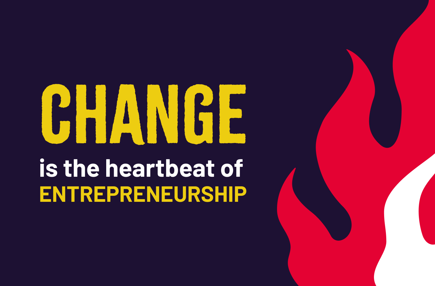
 How to become magnetic

Wear your heart on your sleeve…
Tell people what fuels your fire (your purpose), what you see as sacrosanct (your values), and what you want most in the world (your vision for the future).
Do it boldly, and you’ll attract exactly the right people to your mission.
 The power of nothing
When crafting your brochure, website (or anything for that matter), make it a work of art by striking a careful balance between your headlines, text, imagery and… absolutely nothing!
Simply put, resist the urge to clutter and instead use space beautifully to spotlight what truly matters.
Just like an art gallery.
 Harness the window of opportunity
Did you know you only have 8 seconds to captivate your audience before they move to the next thing? That’s one of the reasons brand alignment is so important.
Ever visited a website and thought… ‘something’s doesn’t feel right, but I can’t pinpoint it’.
This is often triggered when your brand fires mixed messages – when you say one thing but show up differently. Such as selling a premium service with a chaotic website. This misalignment will make people move on faster than you can say “quality”.
 Embrace the impact of colour

Colour triggers human emotion.
When used consistently, your brand colours will lead to recognition and shape faster decision-making.
A diverse colour palette can be wonderful, but if you can really dominate a single colour — think Cadburys — this is the fastest way to instant recognition! Can you taste the silky smooth chocolate already?
 Identify your weaknesses and turn them into strengths
Let’s show you what we mean…
Sometimes your weaknesses can be your biggest strengths. Think about it: a seemingly slow delivery could be your hidden gem — a testament to your unmatched quality and attention to detail.
This might be precisely what your clients want, and they may be willing to pay a premium for it!
 Play on personality
‘Beauty attracts the eye, but personality captures the heart’ Oscar Wilde.
Your brand is far more than just a visual design. It has its own character – even in B2B. Take time to truly understand and define your brand’s personality, so you know exactly how it should sound, act, and look.
Wrap it all into a clear personality guide so that your whole team understands this too. Without it, too many voices risk turning your brand into a chaotic symphony!
 A picture is worth a thousand words. Keep it that way

Avoid overloading images with too much information.
Instead, imagine you’re designing a billboard. Strive for captivating images that intrigue, and keep any overlaying text to an absolute minimum. This will prompt people to read the description.
Oh, and remember, most social media algorithms favour visuals with less text, so keep things clean to achieve maximum reach.
 Never forget the call to action
Obvious yes, yet surprisingly often overlooked!
After pouring time and effort into creating something insightful, the last thing you want is to hit publish and then realise, ‘Oops! We forgot the web link.’ And no one has a clue how to actually buy from you.
This smallest detail makes the biggest impact.
 Make sure your logo is memorable for the right reasons!
Stamped on everything you produce, your logo needs to work in all sizes. But remember, when printed, it will also be seen from different angles.
Test its versatility with a simple rotation check. Leaving no room for any… ahem… embarrassing misinterpretation.
 Create an instruction manual for your brand
Your brand bible is the ‘how to’ guide for your company’s identity – take time to invest in it.
This single source of truth instructs you (and your team) how to show up consistently – visually and verbally. This becomes increasingly important as you scale and more and more people are communicating on behalf of your brand.
The next step is to use a digital asset management (DAM) tool for your brand elements to ensure everyone has access to the latest files.
 A fresh perspective
What does an animal, a superhero or even a pudding have to do with branding?
These are all abstract questions we love to ask our clients to help us all understand how their brand should look and feel. Try this creative exercise with your team, it might reveal something extraordinary…
If your brand were an animal, which would it be? How about a dessert? What kind of noise would it be? Or texture? The magic lies in going deeper by asking, “Why?”. Why is our brand associated with an armadillo or a pyramid of profiteroles? This playful team exercise can give you a fresh perspective and deeper collective understanding. Have fun with it!
 Brand voice and brand tone

Defining your brand messaging but unsure of the difference between brand voice and tone? This should help…
Your brand voice expresses your personality, values and purpose. And it stays the same.
Your brand tone adds context and emotion. And it can flex — depending on the subject and your audience, while staying true to your brand voice.
 Make your mark, consistently
Logo consistency is crucial.
It’s tempting to ignore the ‘do not do’ page in an otherwise beautiful brand bible, but it serves an important purpose – to protect the integrity of your logo.
This leads to recognition, but more importantly, trust. If you show up consistently, your clients will trust that you’ll do the same for them. Simple.
 Back away from the stock shots
Our take on stock imagery? One word: avoid.
‘Impossible!’ you say. And we hear you. So instead, our advice is to get clever.
Most stock images are generic and overused. They can cause people to disconnect with your brand. But what do you do if there’s no budget for photography?
Master the art of sourcing meaningful images without the cliché so they resonate and feel authentic to your audience. Alternatively, add creative overlays to your stock images to add some individuality and align them with your brand.
 Check, check, and check again
We’ve all experienced that ‘oh sh*t!’ moment when we’ve published something with a glaring error.
Our advice? Create a simple checklist to avoid content calamity and align every detail of your brand’s brilliance before you hit ‘go live’.
Here’s a starter for your pre-publish checklist. Simply add anything else that’s important to you…
Is your logo in place? • Does your UVP shine through? • Is it in your brand voice? • Have you answered the ‘now what?’ and ‘so what?’ questions? • Is there a clear call to action? • No embarrassing typos?
You get the picture. 😉
 Tap into the power of emotion
If you want people to take action, you need to move them in some way. So, before you craft any message, ask yourself this crucial question.
How do you most want people to feel?
Excited? Ready? Reassured? Empowered? Or something else? Answering this question will help you pitch your brand and content in a way that sparks a genuine emotional connection. Not only will you become more engaging and memorable, but you’ll inspire people to act. 🔥
 Don’t be shy!
Nervous of making yourself visible as a business leader?
Here’s why you should put your story at the heart of your brand…
Business is about more than just products and services, people want to hear the real human story behind your company.
By sharing your story, you’ll infuse your mission with passion and purpose. This will help you connect more deeply with your audience and inspire people to jump on board.
 Leave the art to the artists
Avoid art for art’s sake – unless you’re in the ‘art’ business.
Each element of your brand should be there for a reason. Carrying meaning and purpose to add layers of colour, texture, and depth. This builds a narrative for your brand. Whether it’s the reasoning behind your specific brand colours or the significance of your logo, every part should tell a story.
 Your design can be stylish and inclusive at the same time!
Always prioritise accessibility over design trends.
When it comes to design, colour balance isn’t just about aesthetics — it’s crucial for inclusivity.
The combination of text and background colours matters. Low-contrast colours create readability challenges, especially for people with limited vision or colour blindness. This is true for both web and print. Use tools like Adobe’s Colour Contrast Checker to help you pick trendy hues that are also accessible.
 Bad TyP0grAphY is a BIG no-no!

See what we mean 😉
Typography is a fundamental element of your brand. The right fonts will help you to create visual hierarchy and express your brand personality.
Respect type and make it beautiful by ensuring it’s balanced, well-spaced, and legible.
Stick to just one or two different fonts, and don’t overlook the importance of colour contrast; if you missed it, reread tip #20 above.
 Always put your customers first
We applaud daring brands that break with convention. But here’s a word of caution…
Dare to be different, play with creativity, and be brave enough to take a risk or two. But never forget the golden rule: always keep your customers in mind. The recent Bond Street transformation into Burberry Street for London Fashion Week left Central Line passengers utterly baffled, generating some damning press for Burberry and TFL.
So remember: customers first, creativity second.
 One style rules
Are your image styles scattered and chaotic?
If so, this will confuse and dilute the impact of your visual brand.
Instead, stick to one signature style to establish a clear, attractive and recognisable brand aesthetic. By doing this, your audience will connect this specific look and feel with your business – enhancing recognition. (And who doesn’t want that?) 😉
 To theme or not to theme?
When executed with flair, theming your logo can be playful and eye-catching — an approach Google embraces daily.
While we emphasise the importance of brand consistency (A LOT!), there are occasions when you can break the rules. To celebrate Christmas for example, or to make a bold statement.
Just remember, if you’re going to do it, do it for the right reason. And do it exceptionally well!
So that’s it!
Remember, your brand is more than just a logo or slogan. It’s your promise to your customers. It’s the experience they have when they interact with your business. Creating a brand is all about building a lasting impression that keeps people coming back for more.
Need any help? Get in touch: mailus@firestarter.live